System Indicators
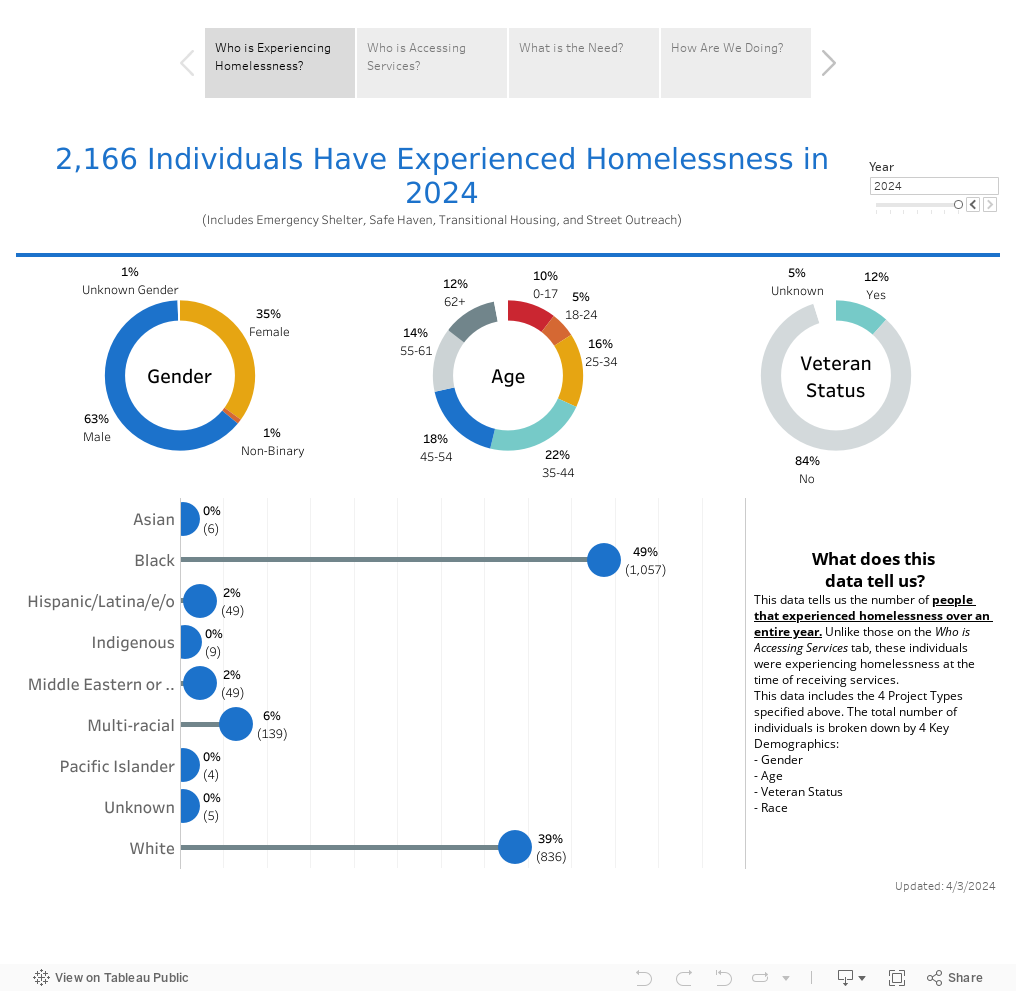
The System Indicators dashboard displays all persons that have experienced homelessness or received services in our system; it shows how homelessness changes over time, including inflow and outflow from the Coordinated Entry System (CES) which is the process in which our community identifies, assesses, and matches individuals to resources need to resolve homelessness.
For questions about this dashboard, please email Danielle Bagg Wireman.
For questions about this dashboard, please email Danielle Bagg Wireman.
How to use the dashboard:
This dashboard contains a lot of information, but you can hover your mouse over the data points to see information pop-ups and learn more. You can also view the dashboard using different filters that will impact what information is highlighted in the dashboard’s presentation.
This dashboard contains a lot of information, but you can hover your mouse over the data points to see information pop-ups and learn more. You can also view the dashboard using different filters that will impact what information is highlighted in the dashboard’s presentation.